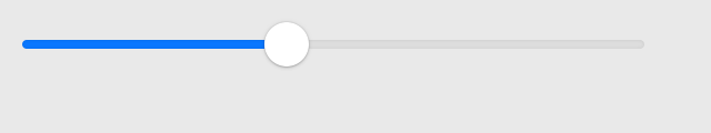
Slider
A widget for selecting a value within a range. The range is shown as a horizontal line, and the selected value is shown as a draggable marker.


Not supported
Not supported
Usage
A slider can either be continuous (allowing any value within the range), or discrete (allowing a fixed number of equally-spaced values). For example:
import toga

def my_callback(slider):
    print(slider.value)

# Continuous slider, with an event handler.
toga.Slider(range=(-5, 10), value=7, on_change=my_callback)

# Discrete slider, accepting the values [0, 1.5, 3, 4.5, 6, 7.5].
toga.Slider(range=(0, 7.5), tick_count=6)
Reference
- class toga.Slider(id=None, style=None, value=None, min=None, max=None, tick_count=None, on_change=None, on_press=None, on_release=None, enabled=True, range=None)
Bases:
WidgetCreate a new Slider widget.
- Parameters:
id (str | None) – The ID for the widget.
style – A style object. If no style is provided, a default style will be applied to the widget.
value (float | None) – Initial
valueof the slider. Defaults to the mid-point of the range.min (float) – Initial minimum value of the slider. Defaults to 0.
max (float) – Initial maximum value of the slider. Defaults to 1.
tick_count (int | None) – Initial
tick_countfor the slider. IfNone, the slider will be continuous.on_change (callable | None) – Initial
on_changehandler.on_press (callable | None) – Initial
on_presshandler.on_release (callable | None) – Initial
on_releasehandler.enabled (bool) – Whether the user can interact with the widget.
range (tuple[float, float] | None) – DEPRECATED; use
minandmaxinstead. Initialrangeof the slider. Defaults to(0, 1).
- property max: float
Maximum allowed value.
When setting this property, the current
valueandminwill be clipped against the new maximum value.
- property min: float
Minimum allowed value.
When setting this property, the current
valueandmaxwill be clipped against the new minimum value.
- property on_change: callable
Handler to invoke when the value of the slider is changed, either by the user or programmatically.
Setting the widget to its existing value will not call the handler.
- property on_press: callable
Handler to invoke when the user presses the slider before changing it.
- property on_release: callable
Handler to invoke when the user releases the slider after changing it.
- property range: tuple[float, float]
DEPRECATED; use
minandmaxinstead.Range of allowed values, in the form (min, max).
If the provided min is greater than the max, both values will assume the value of the max.
If the current value is less than the provided
min, the current value will be clipped to the minimum value. If the current value is greater than the providedmax, the current value will be clipped to the maximum value.
- property tick_count: int | None
Number of tick marks to display on the slider.
If this is
None, the slider will be continuous.If this is an
int, the slider will be discrete, and will have the given number of possible values, equally spaced within therange.
Setting this property to an
intwill round the current value to the nearest tick.- Raises:
ValueError – If set to a count which is not at least 2 (for the min and max).
Note
On iOS, tick marks are not currently displayed, but discrete mode will otherwise work correctly.
- property tick_step: float | None
Step between adjacent ticks.
If the slider is continuous, this property returns
NoneIf the slider is discrete, it returns the difference in value between adjacent ticks.
This property is read-only, and depends on the values of
tick_countandrange.
- property tick_value: int | None
Value of the slider, measured in ticks.
If the slider is continuous, this property returns
None.If the slider is discrete, it returns an integer between 1 (representing
min) andtick_count(representingmax).
- Raises:
ValueError – If set to anything inconsistent with the rules above.
- property value: float
Current value.
If the slider is discrete, setting the value will round it to the nearest tick.
- Raises:
ValueError – If set to a value which is outside of the
range.