Switch
A clickable button with two stable states: True (on, checked); and False (off, unchecked). The button has a text label.


Screenshot not available
Not supported
Usage
import toga

switch = toga.Switch()

# What is the current state of the switch?
print(f"The switch is {switch.value}")
Notes
The button and the label are considered a single widget for layout purposes.
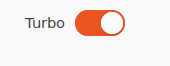
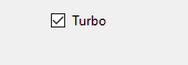
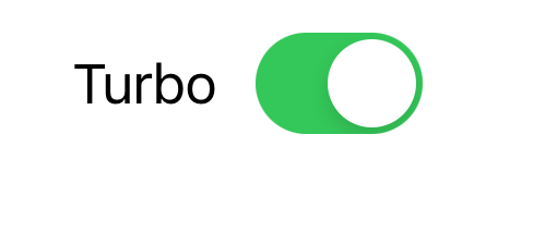
The visual appearance of a Switch is not guaranteed. On some platforms, it will render as a checkbox. On others, it will render as a physical “switch” whose position (and color) indicates if the switch is active. When rendered as a checkbox, the label will appear to the right of the checkbox. When rendered as a switch, the label will be left-aligned, and the switch will be right-aligned.
You should avoid setting a
heightstyle property on Switch widgets. The rendered height of the Switch widget will be whatever the platform style guide considers appropriate; explicitly setting aheightfor the widget can lead to widgets that have a distorted appearance.On macOS, the text color of the label cannot be set directly; any
colorstyle directive will be ignored.
Reference
- class toga.Switch(text, id=None, style=None, on_change=None, value=False, enabled=True)
Bases:
WidgetCreate a new Switch widget.
- Parameters:
text – The text to display beside the switch.
id – The ID for the widget.
style – A style object. If no style is provided, a default style will be applied to the widget.
value (bool) – The initial value for the switch.
on_change (callable | None) – A handler that will be invoked when the switch changes value.
enabled (bool) – Is the switch enabled (i.e., can it be pressed?). Optional; by default, switches are created in an enabled state.
- property on_change: callable
The handler to invoke when the value of the switch changes.
- property text: str
The text label for the Switch.
None, and the Unicode codepoint U+200B (ZERO WIDTH SPACE), will be interpreted and returned as an empty string. Any other object will be converted to a string usingstr().Only one line of text can be displayed. Any content after the first newline will be ignored.
- toggle()
Reverse the current value of the switch.