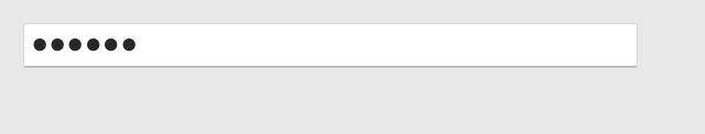
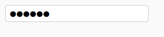
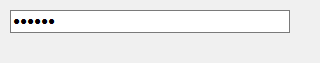
PasswordInput
A widget to allow the entry of a password. Any value typed by the user will be obscured, allowing the user to see the number of characters they have typed, but not the actual characters.

Not supported
Not supported
Usage
The PasswordInput is functionally identical to a TextInput, except
for how the text is displayed. All features supported by TextInput are
also supported by PasswordInput.
import toga

password = toga.PasswordInput()
Notes
Winforms does not support the use of partially or fully transparent colors for the PasswordInput background. If a color with an alpha value is provided (including
TRANSPARENT), the alpha channel will be ignored. ATRANSPARENTbackground will be rendered as white.On Winforms, if a PasswordInput is given an explicit height, the rendered widget will not expand to fill that space. The widget will have the fixed height determined by the font used on the widget. In general, you should avoid setting a
heightstyle property on PasswordInput widgets.
Reference
- class toga.PasswordInput(id=None, style=None, value=None, readonly=False, placeholder=None, on_change=None, on_confirm=None, on_gain_focus=None, on_lose_focus=None, validators=None)
Bases:
TextInputCreate a new password input widget.
- Parameters:
id – The ID for the widget.
style – A style object. If no style is provided, a default style will be applied to the widget.
value (str | None) – The initial content to display in the widget.
readonly (bool) – Can the value of the widget be modified by the user?
placeholder (str | None) – The content to display as a placeholder when there is no user content to display.
on_change (callable | None) – A handler that will be invoked when the value of the widget changes.
on_confirm (callable | None) – A handler that will be invoked when the user accepts the value of the input (usually by pressing Return on the keyboard).
on_gain_focus (callable | None) – A handler that will be invoked when the widget gains input focus.
on_lose_focus (callable | None) – A handler that will be invoked when the widget loses input focus.
validators (list[callable] | None) – A list of validators to run on the value of the input.