MultilineTextInput
A scrollable panel that allows for the display and editing of multiple lines of text.

Not supported
Not supported
Usage
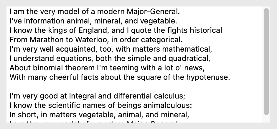
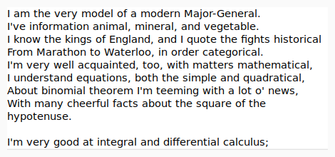
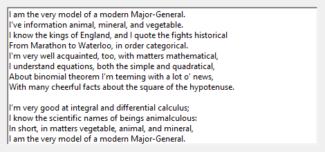
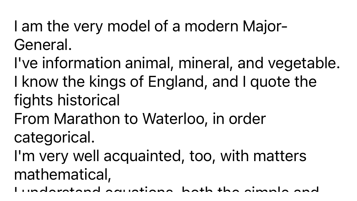
import toga

textbox = toga.MultilineTextInput()
textbox.value = "Some text.\nIt can be multiple lines of text."
The input can be provided a placeholder value - this is a value that will be displayed to the user as a prompt for appropriate content for the widget. This placeholder will only be displayed if the widget has no content; as soon as a value is provided (either by the user, or programmatically), the placeholder content will be hidden.
Notes
Winforms does not support the use of partially or fully transparent colors for the MultilineTextInput background. If a color with an alpha value is provided (including
TRANSPARENT), the alpha channel will be ignored. ATRANSPARENTbackground will be rendered as white.
Reference
- class toga.MultilineTextInput(id=None, style=None, value=None, readonly=False, placeholder=None, on_change=None)
Bases:
WidgetCreate a new multi-line text input widget.
- Parameters:
id – The ID for the widget.
style – A style object. If no style is provided, a default style will be applied to the widget.
value (str | None) – The initial content to display in the widget.
readonly (bool) – Can the value of the widget be modified by the user?
placeholder (str | None) – The content to display as a placeholder when there is no user content to display.
on_change (callable | None) – A handler that will be invoked when the value of the widget changes.
- property on_change: callable
The handler to invoke when the value of the widget changes.
- property placeholder: str
The placeholder text for the widget.
A value of
Nonewill be interpreted and returned as an empty string. Any other object will be converted to a string usingstr().
- property readonly: bool
Can the value of the widget be modified by the user?
This only controls manual changes by the user (i.e., typing at the keyboard). Programmatic changes are permitted while the widget has
readonlyenabled.
- scroll_to_bottom()
Scroll the view to make the bottom of the text field visible.
- scroll_to_top()
Scroll the view to make the top of the text field visible.