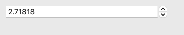
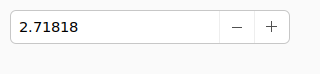
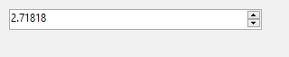
NumberInput
A text input that is limited to numeric input.

Not supported
Not supported
Usage
import toga

widget = toga.NumberInput(min_value=1, max_value=10, step=0.001)
widget.value = 2.718
NumberInput’s properties can accept integers, floats, and strings containing
numbers, but they always return decimal.Decimal objects to ensure
precision is retained.
Reference
- class toga.NumberInput(id=None, style=None, step=1, min=None, max=None, value=None, readonly=False, on_change=None, min_value=None, max_value=None)
Bases:
WidgetCreate a new number input widget.
- Parameters:
id – The ID for the widget.
style – A style object. If no style is provided, a default style will be applied to the widget.
step (Decimal) – The amount that any increment/decrement operations will apply to the widget’s current value.
min (Decimal | None) – If provided,
valuewill be guaranteed to be greater than or equal to this minimum.max (Decimal | None) – If provided,
valuewill be guaranteed to be less than or equal to this maximum.value (Decimal | None) – The initial value for the widget.
readonly (bool) – Can the value of the widget be modified by the user?
on_change (callable | None) – A handler that will be invoked when the value of the widget changes.
min_value (Decimal | None) – DEPRECATED; alias of
min.max_value (Decimal | None) – DEPRECATED; alias of
max.
- property max: Decimal | None
The maximum bound for the widget’s value.
Returns
Noneif there is no maximum bound.When setting this property, the current
valueandminwill be clipped against the new maximum value.
- property min: Decimal | None
The minimum bound for the widget’s value.
Returns
Noneif there is no minimum bound.When setting this property, the current
valueandmaxwill be clipped against the new minimum value.
- property on_change: callable
The handler to invoke when the value of the widget changes.
- property readonly: bool
Can the value of the widget be modified by the user?
This only controls manual changes by the user (i.e., typing at the keyboard). Programmatic changes are permitted while the widget has
readonlyenabled.
- property step: Decimal
The amount that any increment/decrement operations will apply to the widget’s current value. (Not all backends provide increment and decrement buttons.)
- property value: Decimal | None
Current value of the widget, rounded to the same number of decimal places as
step, orNoneif no value has been set.If this property is set to a value outside of the min/max range, it will be clipped.
While the widget is being edited by the user, it is possible for the UI to contain a value which is outside of the min/max range, or has too many decimal places. In this case, this property will return a value that has been clipped and rounded, and the visible text will be updated to match as soon as the widget loses focus.