Text Input#
The text input widget is a simple input field for user entry of text data.
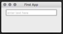
Usage#
import toga

input = toga.TextInput(placeholder='enter name here')
Reference#
- class toga.widgets.textinput.TextInput(id=None, style=None, factory=None, value=None, placeholder=None, readonly=False, on_change=None, on_gain_focus=None, on_lose_focus=None, validators=None, initial=None)#
A widget get user input.
- Parameters:
id (str) – An identifier for this widget.
style (
Style) – An optional style object. If no style is provided then a new one will be created for the widget.value (str) – The initial text for the input.
placeholder (str) – If no input is present this text is shown.
readonly (bool) – Whether a user can write into the text input, defaults to False.
on_change (
callable) – Method to be called when text is changed in text boxvalidators (list) – list of validators to run on the value of the text box. Should return None is value is valid and an error message if not.
on_change – The handler to invoke when the text changes.
on_gain_focus (
callable) – Function to execute when get focused.on_lose_focus (
callable) – Function to execute when lose focus.
Create a base Toga widget.
This is an abstract base class; it cannot be instantiated.
- Parameters:
id – The ID for the widget.
style – A style object. If no style is provided, a default style will be applied to the widget.
- MIN_WIDTH = 100#
- clear()#
Clears the text of the widget.
- property is_valid#
- property on_change#
The handler to invoke when the value changes.
- Returns:
The function
callablethat is called on a content change.
- property on_gain_focus#
The handler to invoke when the widget get focus.
- Returns:
The function
callablethat is called on widget focus gain.
- property on_lose_focus#
The handler to invoke when the widget lose focus.
- Returns:
The function
callablethat is called on widget focus loss.
- property placeholder#
The placeholder text.
- Returns:
The placeholder text as a
str.
- property readonly#
Whether a user can write into the text input.
- Returns:
Trueif only read is possible.Falseif read and write is possible.
- validate()#
- property validators#
- property value#
The value of the text input field.
- Returns:
The current text of the widget as a
str.