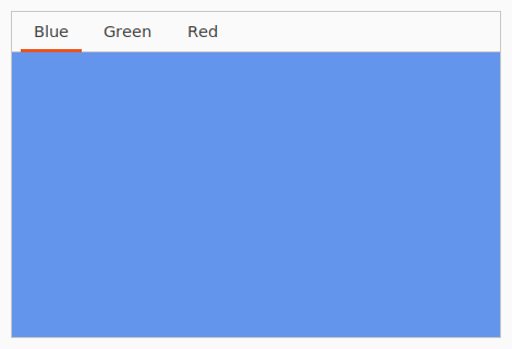
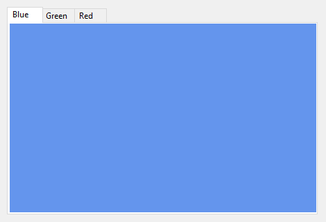
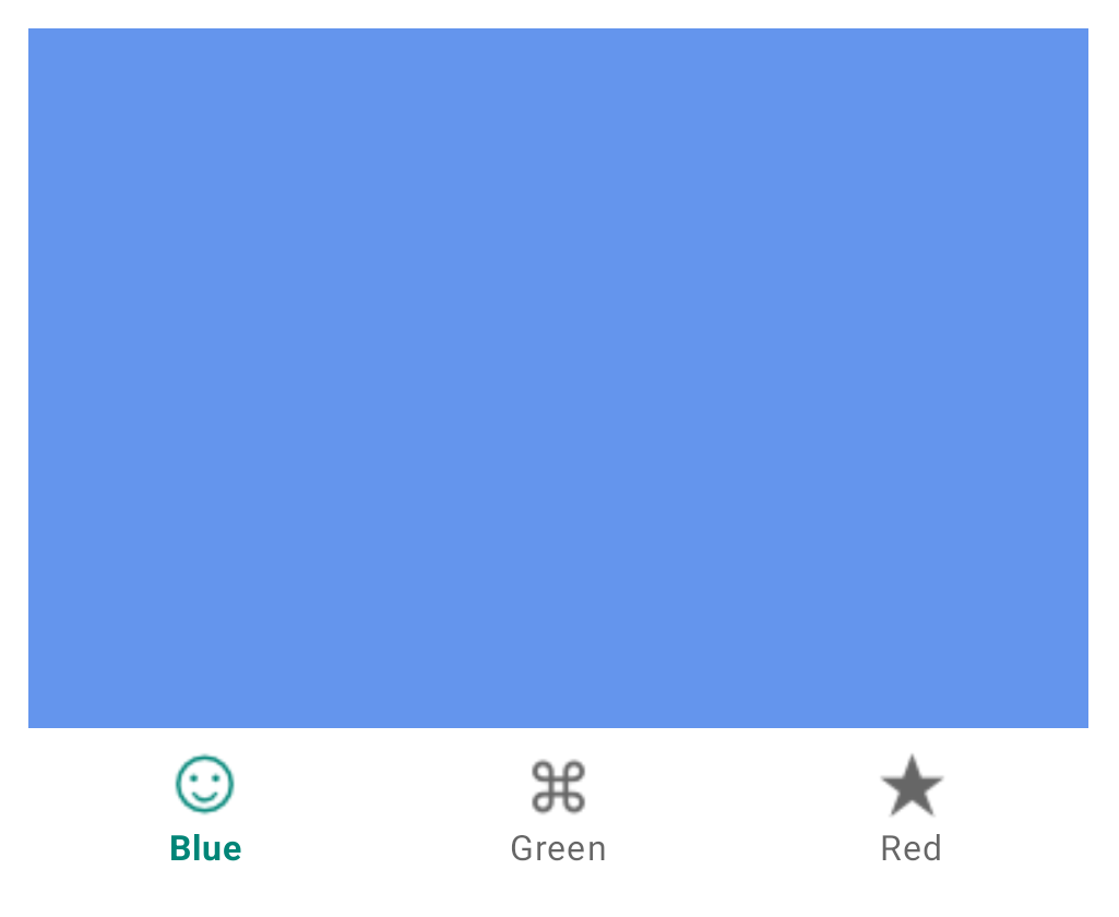
OptionContainer#
A container that can display multiple labeled tabs of content.
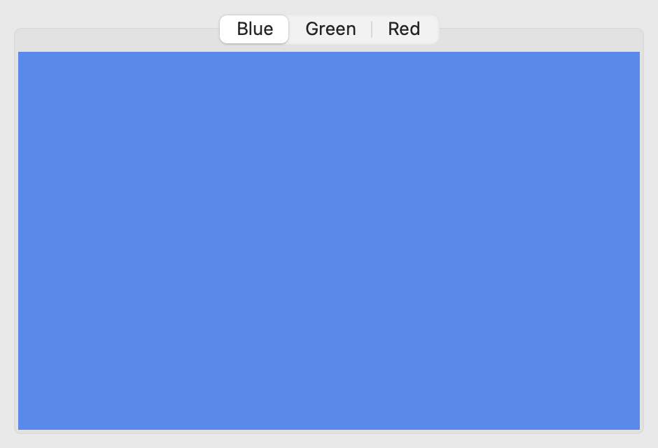
Not supported
Not supported
Usage#
The content of an OptionContainer is a list of widgets that will form discrete tabs in the display. Each tab can be identified by a label, and, optionally, an icon. This list of content can be modified after initial construction:
import toga

pizza = toga.Box()
pasta = toga.Box()

# Create 2 initial tabs; one with an icon, and one without.
container = toga.OptionContainer(
    content=[("Pizza", pizza), ("Pasta", pasta, toga.Icon("pasta"))]
)

# Add another tab of content, without an icon.
salad = toga.Box()
container.content.append("Salad", salad)

# Add another tab of content, with an icon
icecream = toga.Box()
container.content.append("Ice Cream", icecream, toga.Icon("icecream"))
OptionContainer content can also be specified by using OptionItem instances
instead of tuples. This enables you to be explicit when setting an icon or enabled
status; it also allows you to set the initial enabled status without setting an icon:
import toga

pizza = toga.Box()
pasta = toga.Box()

# Create 2 initial tabs; one with an icon, and one without.
container = toga.OptionContainer(
    content=[
      toga.OptionItem("Pizza", pizza),
      toga.OptionItem("Pasta", pasta, icon=toga.Icon("pasta"))
    ]
)

# Add another tab of content, initially disabled, without an icon.
salad = toga.Box()
container.content.append(toga.OptionItem("Salad", salad, enabled=False))
When retrieving or deleting items, or when specifying the currently selected item, you can specify an item using:
The index of the item in the list of content:
# Insert a new second tab
container.content.insert(1, "Soup", toga.Box())
# Make the third tab the currently active tab
container.current_tab = 2
# Delete the second tab
del container.content[1]
The string label of the tab:
# Insert a tab at the index currently occupied by a tab labeled "Pasta"
container.content.insert("Pasta", "Soup", toga.Box())
# Make the tab labeled "Pasta" the currently active tab
container.current_tab = "Pasta"
# Delete tab labeled "Pasta"
del container.content["Pasta"]
A reference to an
OptionItem:# Get a reference to the "Pasta" tab pasta_tab = container.content["Pasta"] # Insert content at the index currently occupied by the pasta tab container.content.insert(pasta_tab, "Soup", toga.Box()) # Make the pasta tab the currently active tab container.current_tab = pasta_tab # Delete the pasta tab del container.content[pasta_tab]
Notes#
The use of icons on tabs varies between platforms. If the platform requires icons, and no icon is provided, a default icon will be used. If the platform does not support icons, any icon provided will be ignored, and requests to retrieve the icon will return
None.The behavior of disabled tabs varies between platforms. Some platforms will display the tab, but put it in an unselectable state; some will hide the tab. A hidden tab can still be referenced by index - the tab index refers to the logical order, not the visible order.
iOS can only display 5 tabs. If there are more than 5 visible tabs in an OptionContainer, the last item will be converted into a “More” option that will allow the user to select the additional items. While the “More” menu is displayed, the current tab will return as
None.Android can only display 5 tabs. The API will allow you to add more than 5 tabs, and will allow you to programmatically control tabs past the 5-item limit, but any tabs past the limit will not be displayed or be selectable by user interaction. If the OptionContainer has more than 5 tabs, and one of the visible tabs is removed, one of the previously unselectable tabs will become visible and selectable.
iOS allows the user to rearrange icons on an OptionContainer. When referring to tabs by index, user re-ordering is ignored; the logical order as configured in Toga itself is used to identify tabs.
Icons for iOS OptionContainer tabs should be 25x25px alpha masks.
Icons for Android OptionContainer tabs should be 24x24px alpha masks.
Reference#
-
type OptionContainerContent#
An item of
OptionContainercontent can be:a 2-tuple, containing the title for the tab, and the content widget;
a 3-tuple, containing the title, content widget, and
iconfor the tab;a 4-tuple, containing the title, content widget,
iconfor the tab, and enabled status; oran
OptionIteminstance.
- class toga.OptionContainer(id=None, style=None, content=None, on_select=None)#
Bases:
WidgetCreate a new OptionContainer.
- Parameters:
id – The ID for the widget.
style – A style object. If no style is provided, a default style will be applied to the widget.
content (list[OptionContainerContent] | None) – The initial
OptionContainer contentto display in the OptionContainer.on_select (OnSelectHandler | None) – Initial
on_selecthandler.
- property content: OptionList#
The tabs of content currently managed by the OptionContainer.
- property current_tab: OptionItem | None#
The currently selected tab of content, or
Noneif there are no tabs, or the OptionContainer is in a state where no tab is currently selected.This property can also be set with an
intindex, or astrlabel.
- property enabled: bool#
Is the widget currently enabled? i.e., can the user interact with the widget?
OptionContainer widgets cannot be disabled; this property will always return True; any attempt to modify it will be ignored.
- focus()#
No-op; OptionContainer cannot accept input focus
- property on_select: OnSelectHandler#
The callback to invoke when a new tab of content is selected.
- class toga.OptionItem(text, content, *, icon=None, enabled=True)#
A tab of content in an OptionContainer.
- Parameters:
text (str) – The text label for the new tab.
content (Widget) – The content widget to use for the new tab.
icon (IconContent | None) – The
icon contentto use to represent the tab.enabled (bool) – Should the new tab be enabled?
- property icon: Icon#
The Icon for the tab of content.
Can be specified as any valid
icon content.If the platform does not support the display of icons, this property will return
Noneregardless of any value provided.
- property index: int | None#
The index of the tab in the OptionContainer.
Returns
Noneif the tab isn’t currently part of an OptionContainer.
- property interface: OptionContainer#
The OptionContainer that contains this tab.
Returns
Noneif the tab isn’t currently part of an OptionContainer.
- class toga.widgets.optioncontainer.OptionList(interface)#
- __delitem__(index)#
Same as
remove.- Parameters:
index (int | str | OptionItem) –
- __getitem__(index)#
Obtain a specific tab of content.
- Parameters:
index (int | str | OptionItem) –
- Return type:
- append(text_or_item: OptionItem)#
- append(text_or_item: str, content: Widget, *, icon: IconContent | None = None, enabled: bool = True)
Add a new tab of content to the OptionContainer.
The new tab can be specified as an existing
OptionIteminstance, or by specifying the full details of the new tab of content. If anOptionItemis provided, specifyingcontent,iconorenabledwill raise an error.- Parameters:
text_or_item – An
OptionItem; or, the text label for the new tab.content – The content widget to use for the new tab.
icon – The
icon contentto use to represent the tab.enabled – Should the new tab be enabled? (Default:
True)
- index(value)#
Find the index of the tab that matches the given value.
- Parameters:
value (str | int | OptionItem) – The value to look for. An integer is returned as-is; if an
OptionItemis provided, that item’s index is returned; any other value will be converted into a string, and the first tab with a label matching that string will be returned.- Raises:
ValueError – If no tab matching the value can be found.
- insert(index: int | str | OptionItem, text_or_item: OptionItem)#
- insert(index: int | str | OptionItem, text_or_item: str, content: Widget, *, icon: IconContent | None = None, enabled: bool = True)
Insert a new tab of content to the OptionContainer at the specified index.
The new tab can be specified as an existing
OptionIteminstance, or by specifying the full details of the new tab of content. If anOptionItemis provided, specifyingcontent,iconorenabledwill raise an error.- Parameters:
index – The index where the new tab should be inserted.
text_or_item – An
OptionItem; or, the text label for the new tab.content – The content widget to use for the new tab.
icon – The
icon contentto use to represent the tab.enabled – Should the new tab be enabled? (Default:
True)
- remove(index)#
Remove the specified tab of content.
The currently selected item cannot be deleted.
- Parameters:
index (int | str | OptionItem) – The index where the new tab should be inserted.
- protocol toga.widgets.optioncontainer.OnSelectHandler#
-
Classes that implement this protocol must have the following methods / attributes:
- __call__(widget, **kwargs)#
A handler that will be invoked when a new tab is selected in the OptionContainer.
Note
**kwargsensures compatibility with additional arguments introduced in future versions.- Parameters:
widget (OptionContainer) – The OptionContainer that had a selection change.
kwargs (Any) –
- Return type:
None